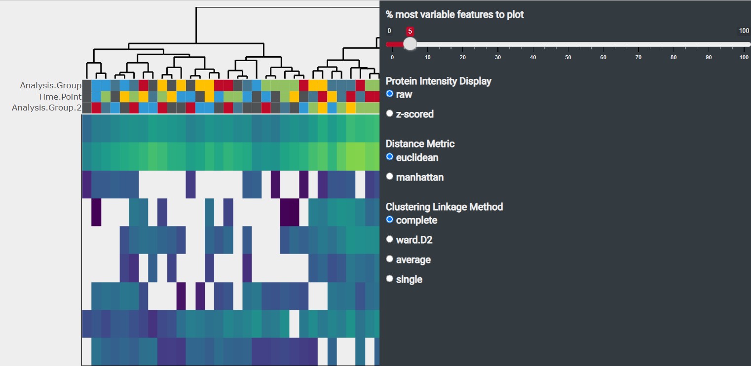
3 Heatmap Tab
The heatmap illustrates the protein expression across samples by plotting the protein intensity. The clustering of samples based on the protein expression is displayed by a dendogram on the top of the heatmap
3.1 Heatmap Options
There are several options to customize the displayed heatmap. They can be accessed using the icon at the top-right of the box
- % most variable features to plot: You can change the number of analytes displayed in the heatmap. By default the 5 % analytes with the highest variability (based on Median Absolute Deviation) are displayed
-
Protein Intensity Display
- raw : The protein intensity values are used untransformed.
- z-scored: The protein intensity values are scaled using z-score standardization3 leading to all proteins being on a shared scale. Choose this method if you are interested in relative comparisons between Protein Groups.
- Distance Metric: You can chose between euclidean and manhattan distance metric method. By default the euclidean distance metric method is used
- Clustering Linkage Method: You can chose between “complete”, “ward.D2”, “average” and “single” as clustering linkage method. By default “complete” is used as clustering linkage method
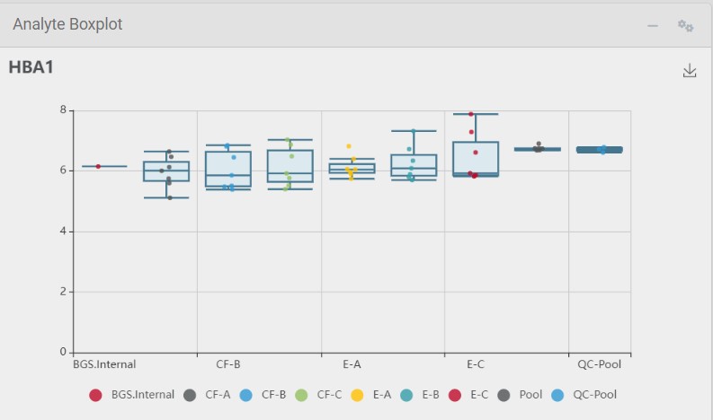
3.2 Analyte Details
Selecting an analyte in the heatmap by clicking on a cell activates the Analyte Details tab which provides you with additional information about the selected analyte
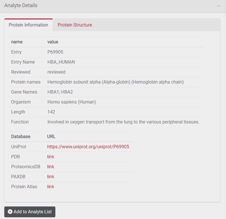
3.2.1 Protein Information Tab
The protein information tab provides you with additional information about the selected analyte such as protein length and function. In addition, links to further databases are provided. You can add this analyte to a customized list of selected analytes by clicking on Add to Analyte List
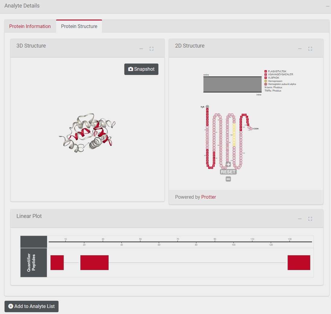
3.2.2 Protein Structure Tab
The left box shows the 3D structure of the selected analyte with quantifier peptides marked in red. The right box illustrates the protein topology of the selected analyte with quantifier peptides marked in red. The box below shows the position of the quantifier peptide in the primary protein sequence.